
With the majority of internet traffic coming from mobile devices, optimizing your website for mobile is no longer optional. Here’s how to ensure your site delivers a great mobile experience:
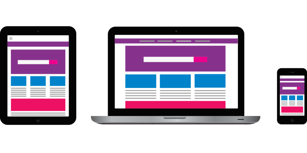
- Responsive Design: Use a responsive layout that adjusts seamlessly to different screen sizes. This ensures your site looks great on smartphones, tablets, and desktops.
- Improve Load Times: Compress images, minimize code, and use caching to reduce loading times. Mobile users expect fast performance, and slow sites often result in high bounce rates.
- Simplify Navigation: Ensure menus, buttons, and links are easy to tap. Avoid cluttered designs and focus on providing a smooth user experience.
- Use Mobile-Friendly Content: Write concise text, use bullet points, and ensure images and videos load properly on smaller screens.
- Test Regularly: Use tools like Google’s Mobile-Friendly Test to identify and fix any issues. Regular testing ensures your site remains optimized as mobile standards evolve.
A mobile-optimized website not only improves user satisfaction but also boosts your rankings, as Google prioritizes mobile-first indexing.